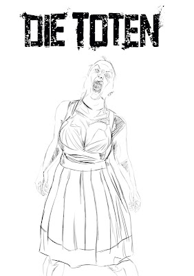
First piece 2011. I did some sketches, finally settled on a pose and happily painted away. But I stopped no less then 3 times and thought to myself: No this is not what I had in mind. This doesn't say "ZOMBIE" to me. It was all too nice, too slick, without meaning and because of the color you couldn't clearly read the head when I reduced the pic to a thumbnail (important for covers).
I mean think of it: Zombies are always outside, night and day, sun and rain. Their clothes get bleached by the daylight, their skin will be swollen by rain and dried by the sun. These creatues won't look nice after awhile. In the end I used an earlier sketch and finished this instead of the others. It's rough, raw, dirty and ugly - like a Zombie should be.
I had the idea to put "it" in a dirndl because of the comicbookseries DIE TOTEN from Zwerchfell. All the stories of this series play in Germany, so the cover always displays something typical from Germany. What is more typically German than something straight from the Oktoberfest? Yup, I thought the same.
*Early Sketches
*WIP
*Final Image
Sascha Thau
Wednesday, May 4, 2011
Friday, January 7, 2011
A YEAR OF THINKING
2010 for me was mostly: theory. Theory of colors, theory of painting, theory, theory, theory. I've read 'Alla prima' from Robert Schmidt, books about marketing and more. I've watched all downloadable classes from conceptart.org and most downloadable Tutorials. I collected an awful amount of art from the internet. Now I understand why the old masters are the old masters.
I was like a dry sponge and soaked everything in. Now I'm so full of knowledge I have to practice what I've learned. And I'm eager to do it.
PLUS: Next month I will move to a bigger city. Yay.
I was like a dry sponge and soaked everything in. Now I'm so full of knowledge I have to practice what I've learned. And I'm eager to do it.
PLUS: Next month I will move to a bigger city. Yay.
Thursday, April 15, 2010
HEAD EXPLODES
Right now I am learning an awful lot. Too much in a way. I really tried to paint this sketch, but I thought the composition is too two-dimensional, too graphic designy flat. Done digitally with Corel Painter.
Saturday, February 27, 2010
Sunday, February 21, 2010
PRACTICE
The first painting where I tried to paint entirely in grayscale and color it later. With reference of course. I think it's a fast way and it's good that you don't get distracted from the color while painting, but I think it's really no fun for me to color the grey aaaaand the colors become dull afterwards. Pretty a 'meh'-technique in my eyes, but who knows, maybe I have to rely on this technique more than I think now.
Nevertheless I never bothered to finish it (the lightsabre and the gun need work, they never got out of the sketch state and there's more of course). I pushed the contrast a bit much, but I never thought I'd show it to anyone else - ever - anyway.
Nevertheless I never bothered to finish it (the lightsabre and the gun need work, they never got out of the sketch state and there's more of course). I pushed the contrast a bit much, but I never thought I'd show it to anyone else - ever - anyway.
Saturday, January 23, 2010
STORY IS KING?
An illustrators blog with probably mostly pictures in it and this is called “story is king”? Uh?
Yes, well, it’s just… it is because I like good stories, even though I don’t like to draw pictures with stories in it (like those). Strange eh? It all boils down to a comment from my fellow colleague and friend Eckart Breitschuh on a Podcast talking about writing… I only knew “kill your darlings” or “keep it simple, stupid”, but “story is king” was so on the right side of the truth. I like to read and I wrote some stories myself and this is it – story is king, there are no two ways about it.
I bow down, get on my knees and all that. It’s all about respect – one of the most important things in life.
Stories are fragile and often times shy things, they have to be nurtured and sometimes whipped and sometimes both at the same time, but in the end we have to recognize them as what they are – one of the greatest things on earth for us fugly humans.
So this is why this is called “story is king” even though it is about pictures: I simply love good stories.
Subscribe to:
Posts (Atom)


